Hip Hop Features
Using k-means cluster to categorize hip hop artists
Hip-Hop Collabs and Popularity
One of the most interesting and unique things about the hip-hop genre is the number of artists that habitually collaborate on their tracks. Jay-Z and Kanye, Dr. Dre and Snoop Dogg, Puff Daddy featuring THE LOX, Biggie, Lil’ Kim (you remember All About the Benjamins, right?). Nearly every artist in the hip hop world has done a collab at some point or another.
Although these artists are phenomenally popular they offer a very small insight as to how hip-hop functions on the ground level. Some artists hardly ever produce songs unaccompanied by one or more other artists. Think about it. When was the last time you heard a Pitbull release where he wasn’t a guest on the track? Yeah, I thought so.
And that’s nothing against Pitbull. Every song associated with an artist’s name, whether a feature artist or the main artist, translates to more money (which presumably translates to more problems). Beyond the finances, however, there seems to be another, more intuitive benefit to featuring on others’ tracks and that is an increase in popularity.
Appealing to persons beyond your typical fan base ought to directly translate to an increase in popularity. Let’s be real, hardly anyone knew who Desiigner was before we heard him sampled on T.L.O.P.
Separating the Jay-Zs from the Pitbulls
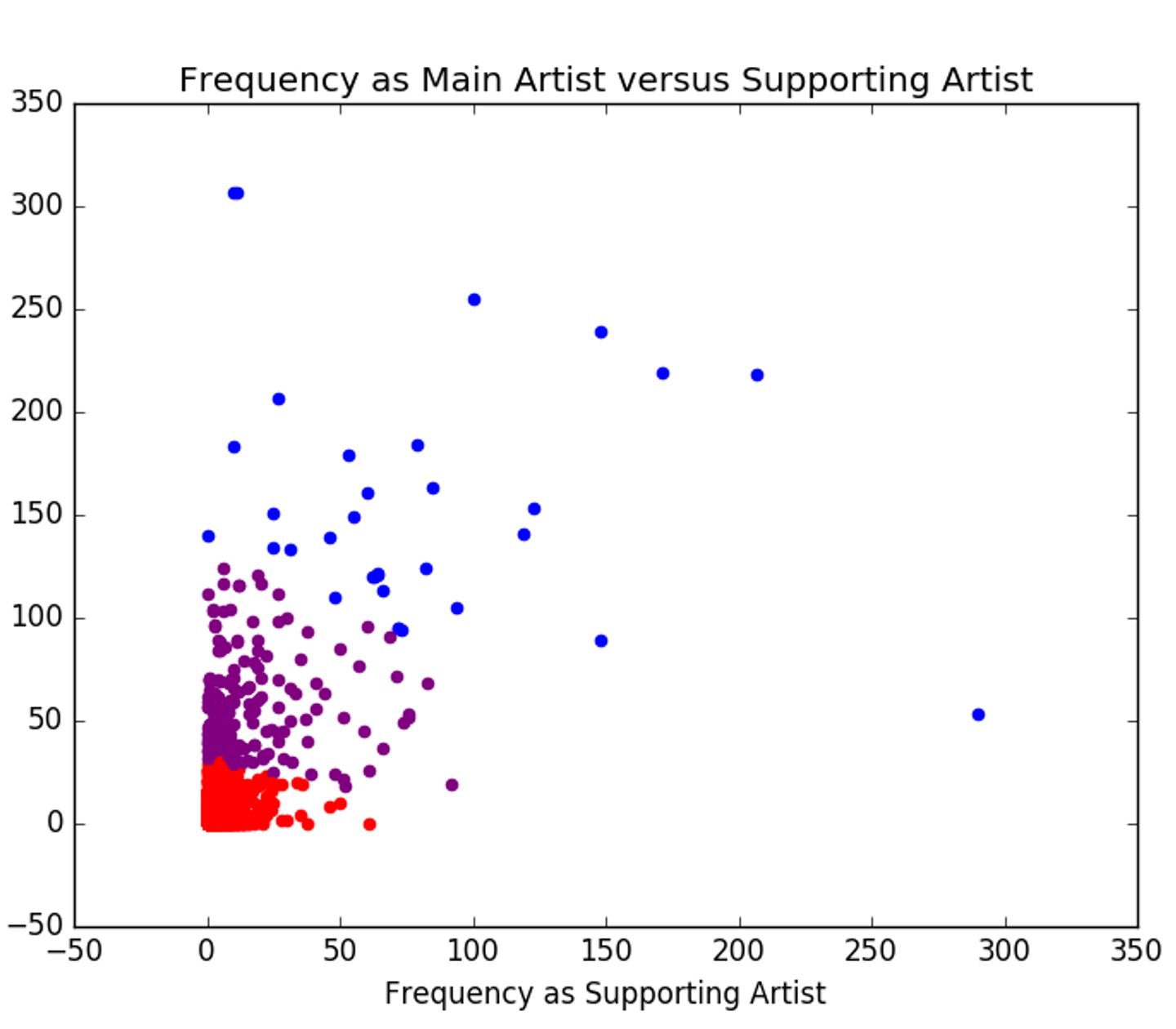
Given a database of roughly 10,000 artists, I sought out to find the relationship between the amount of times an artist leads on a track versus the number of times they feature. I performed a k-means cluster analysis, assuming that there would be three tiers or category of artist (very little features or leads, medium features or leads, many features or leads) on which they would separate.
This graph shows that grouping.

On it’s own it doesn’t really answer any of our questions about artist popularity. Using Spotify’s API, I was able to obtain Spotify’s popularity rating for each of our artists, their rating is an aggregate of the artists’ streams for any song.
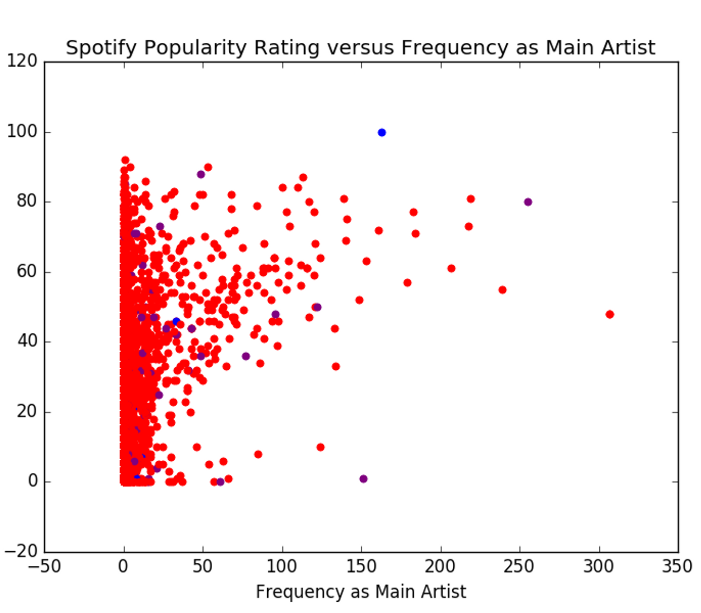
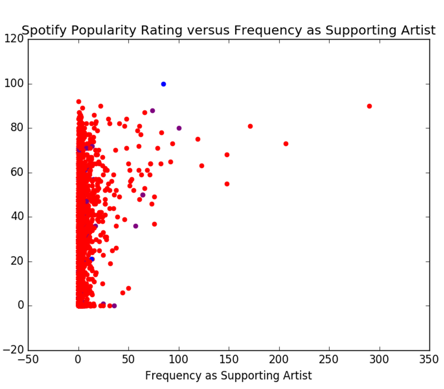
Trusting Spotify to accurately represent an artist’s popularity, we can see how the number of leads and the number of features affect the artist’s popularity rating.


You might be looking at these two graphs and thinking, “What’s the difference?” There is hardly a difference between these two graphs. It seems that the difference in the amount of features and amount of solo tracks an artist is a part of has no real bearing on their popularity (at least not on Spotify).
The correlation statistic, r-squared, describes the degree to which one variable effects or predicts another. I decided to check the difference between the correlation statistics of each variable as a predictor for the Spotify popularity rating. And, of course, there was hardly a difference in the values. ‘Frequency as Main Artist’ had an r-squared of ~27%, while ‘Frequency as Supporting Artist’ showed an r-squared of ~24%, meaning neither of them on their own is a significant predictor of an artist’s popularity.
That doesn’t mean that leading and featuring on tracks don’t make a difference — there is more that we have to consider. Another feature about the graphs, you may have noticed is that the groups shown earlier are no longer well-defined. Wholly, this may not make much sense but there’s an explanation for what we’re seeing.
We have not accounted for time: Early on in an artist’s career it makes sense that they will be involved with more collabs than solo tracks. Once they get famous, they can definitely focus on their own work, but that doesn’t reduce the amount of time they spent featuring. This explains why our red group has a wide variance in popularity.
Unequal group size: We definitely have a surplus of artists in the red group when compared to the other two groups. This is due to the fact that we have some extreme values in the data — those artists with 100 lead and more than 200 features. That throws off the algorithm we use to group the data. So it is very possible we’re not seeing the true spread within the purple and blue groups.